Continued from the previous post on the topic.
Fitting an image to fit the perception
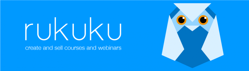
Once all the number crunching was done and we were certain that “rukuku” would be our brand, we set to design the image. We needed to marry the ideal etalon brand qualities with those perceived to be attached to the word “rukuku”. We soon realized that the main challenge was to come up with an interactive solution that was also easy. Looking at the list of perceived brand traits in the previous post, it becomes apparent that we also needed to link some very contradicting traits: male and female, aggressive and cute, facetious and serious, etc. This was becoming really fun!
Our mighty design and programming team is exceptionally strong. Our graphic design work is led by a world-class illustrator, graphics designer and book author Oleg Tischenkov (you should definitely buy his fun interactive book for iPad). Here’s how the process went:
First sketches
 Hm… this sort of looks like an owl with teeth; owl is a bird, but a weird one, and it is generally considered smart. Good idea. Where’s the interactivity we need?
 This origami idea is brilliant! It is as interactive as it gets: anyone can make our logo themselves and interact with it. Plus, origami is Asian, it can be both puzzle and art, and it is fun, and can be easy! This is an ideal solution.
That’s the direction we should go—origami owls. Let’s see what is there in the world of origami owls. Google search reveals hundreds of paper owls, and we like three of them. The idea is to use one of these designs as a basis for our own design:
 All of them look adorable. The next challenge is to choose the one that is ideal for us. The perception histogram for the ideal emphasized easiness, so that’s what we decide to test, and for a couple of days we folded dozens of owls.
The one with long horns (“mimizuku” in Japanese) by Hideo Homatsu is absolutely stunning:
 Let’s try to fold one:
This takes some persistence and skill, but we do not give up:
Finally, we make a bunch of those mimizuku’s, and the results are disappointing. While Hideo Homatsu’s is a brilliantly designed origami owl, it is not easy one. Reject!
Next in line is Fumiaki Shingu’s design:
 This is much easier—a good candidate for modification.
What did we like in the difficult one? It was a mimizuku, i.e. the horned owl, and the horns gave it a mildly aggressive look. We liked its three dimensional eyes and the symmetry of the design. However, Fumiaku Shingu’s owl is definitely facetious, cute and just lovable. Let’s play with it futher and give it the qualities we liked in the mimizuku:
 We discover that with a profound change to the design the owl can be put on its feet. Great! We love more interactivity—the Rukuku Owl can be placed on a desk or a bookshelf as a decorative object. Three dimensional blister eyes are great, but the owl is almost too cute. We need to make it a horned owl. The solution is simple: make small cuts in the folded edges above the eyes and unfold the horns. Done:
 Now we need folding instructions for the Rukuku Owl. They have to be easy, but not too easy. We go through several versions of the folding instructions, use our friends as test subjects, and settle on the one below:
 Finally, we were completely happy, and our super smart lawyers filed for copyright protection. Done.
Stay tuned! Tomorrow’s post will be about our approach to user interface design.
