Our users often email us about features they find most useful in Rukuku so we decided to summarize the fan mail in this post. I will highlight five free features that contest the top position in the “What I love about Rukuku” list.
1. Unlimited participants
Whether you have 1 active customer or a thousand, we are happy to accommodate your needs. We do not impose any limitations on the number of participants in your courses, webinars, or conference calls. Compare this offer to various competing offers out there, and it will become clear that unlimited is hard to find.
2. Free conference calls
Our web conferencing solution is free. Speak for as long as you need, as often as you want – it is free regardless.
3. Free course composer
Create your courses and course materials using our Composer. The tool is absolutely free.
4. Free private classes
If you need a virtual meeting space for an impromptu private class, Rukuku offers that functionality for free. Go to Auditorium, click on Private Classes, and Start New Private Class. Invite other participants by sending them a unique access link using the green “Invite” button. Combined with point #1 above, this is a total winner.
5. Free Storefront
If you want to monetize your courses, we offer you an amazing tool – Storefront. It is a subset of the general Marketplace that resides on your website. You control what items you want to display in your Storefront via a management dashboard. See how it works here: http://malcolmedmonstone.com/online-courses-with-malcolm/
That’s all folks! Don’t be shy to drop us a line about your favorite Rukuku features.
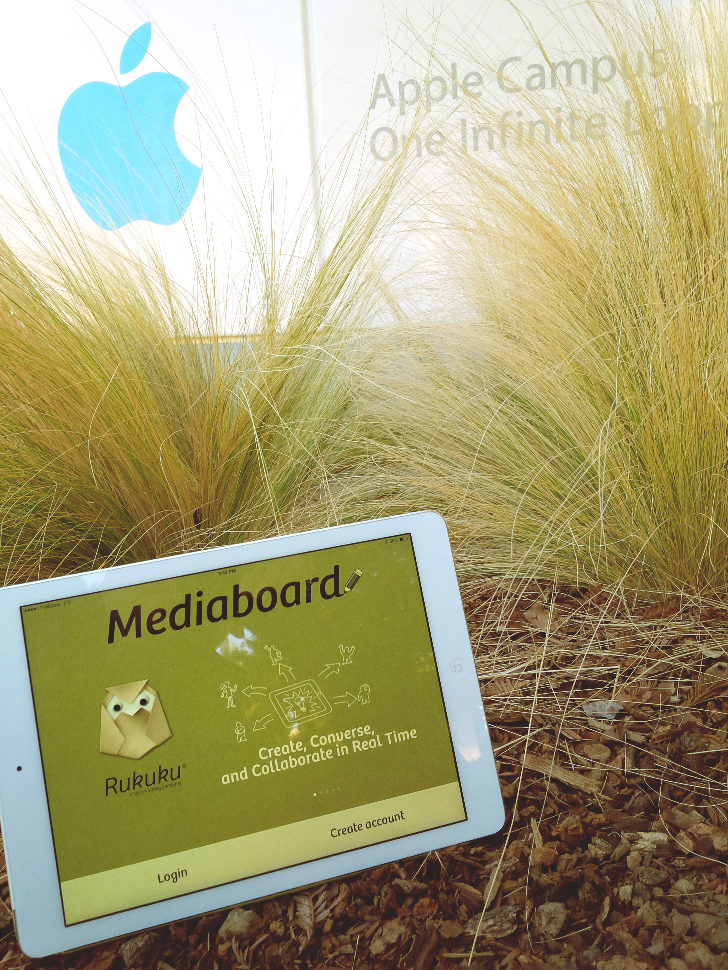
Rukuku Mediaboard is awesome: speaking and sketching in groups has never been easier. When you download and install the app, make sure to allow the App to access your iPad’s microphone and contacts when you first fire it up.
Once you are registered with Rukuku, invite your friends, students and colleagues using the Invite icon in your media board. Enjoy the conversation when they join.
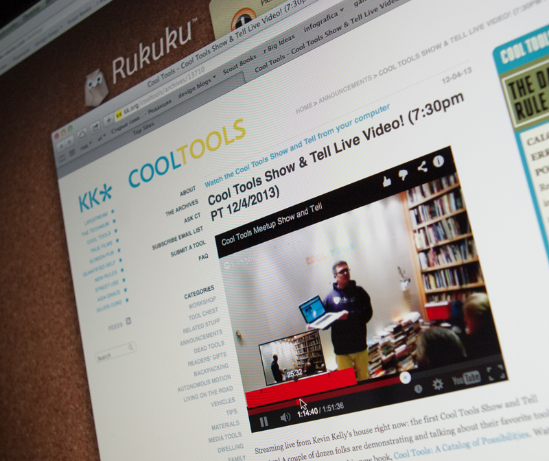
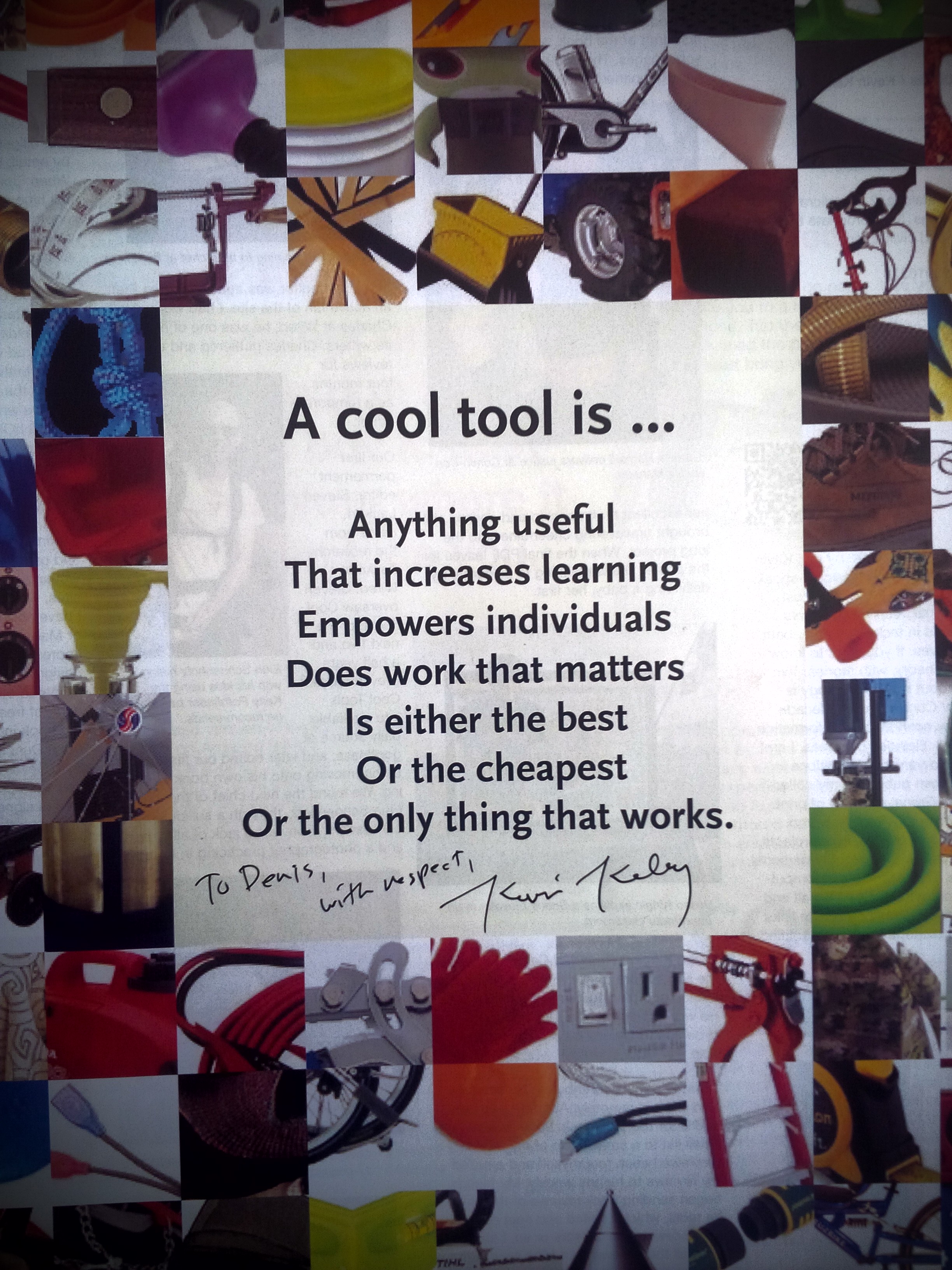
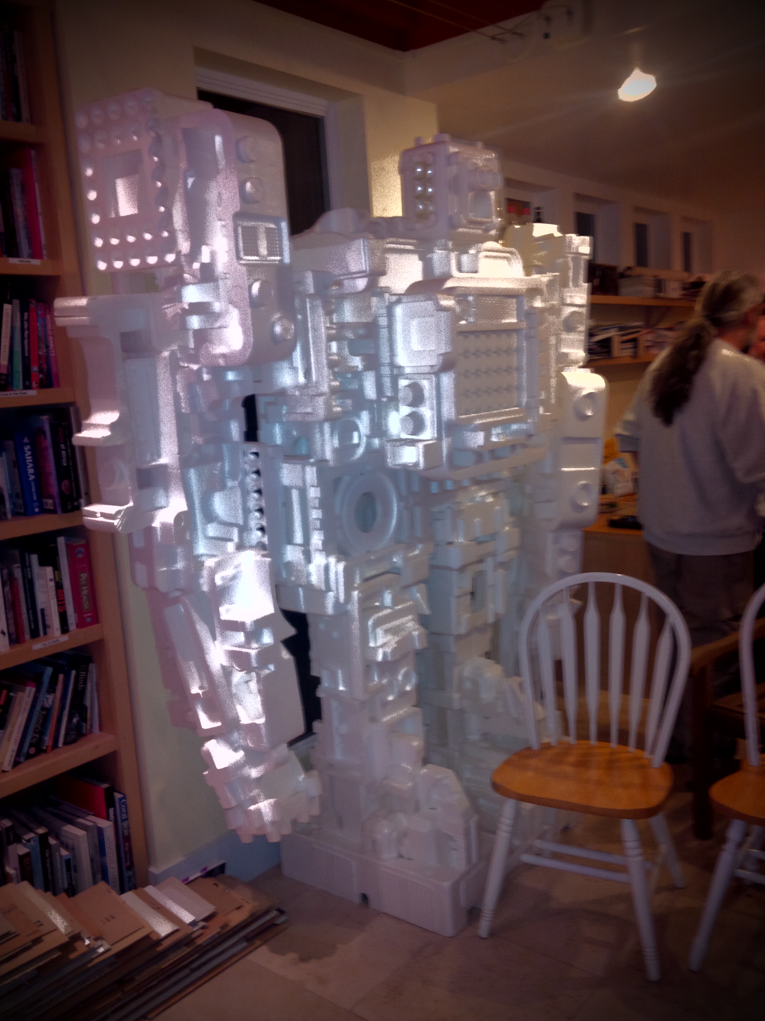
On December 4, I had the honor of showing Rukuku’s toolset at Kevin Kelly‘s first ever Cool Tools show and tell. I like to think of Rukuku as a tool for customizing one’s education, and that makes it a Cool Tool as defined by Kevin Kelly in his latest book Cool Tools: A Catalog Of Possibilities “A cool tool is … Anything useful that increases learning, empowers individuals, does work that matters, is either the best, or the cheapest, or the only thing that works.”
And check out the very cool Styrobot, which Kevin Kelly made together with his son.
If you have an hour and a half to kill, here’ s the recording of the Google Hangout broadcast:
Jef Raskin’s book I mentioned in my previous post devotes a long chapter to “Modes“. These are “a significant source of errors, confusion, unnecessary restrictions, and complexity in interfaces”. A simple example of mode would be how the “shift” key on your keyboard works: pressing “Shift” with a letter key results in a capital letter, but “Shift” and a number key produces a completely different symbol. The author talks about different modal interface features and suggests a number of ways to avoid modality in interfaces.
However there is very little about modality of color. There is cultural modality, i.e. colors have polar meanings in different cultures. For example, Chinese stock market data displays use green for falling prices, and red for raising prices as seen on the official Shenzhen Stock Exchange website:
Western tradition has it completely the opposite way, i.e. red means loss of value and green means growth in value as seen on Bloomberg.com:
If it weren’t for the triangles and the bars showing direction of the stock price movement, the colored numbers of the Shenzhen Stock Exchange alone would be confusing to most of the Western world, and the colored numbers on the Bloomberg website would confuse a lot of mainland Chinese.
Choosing colors for the interface should not be taken lightly as it can be a source of modality and sheer confusion.
At Rukuku, Inc, we are acutely aware of the ability of color to add modality to the interface, and we work hard to avoid such confusion. Our goal is to create the ultimate education marketplace that is a pleasure to use for anyone.
Once all the number crunching was done and we were certain that “rukuku” would be our brand, we set to design the image. We needed to marry the ideal etalon brand qualities with those perceived to be attached to the word “rukuku”. We soon realized that the main challenge was to come up with an interactive solution that was also easy. Looking at the list of perceived brand traits in the previous post, it becomes apparent that we also needed to link some very contradicting traits: male and female, aggressive and cute, facetious and serious, etc. This was becoming really fun!
Our mighty design and programming team is exceptionally strong. Our graphic design work is led by a world-class illustrator, graphics designer and book author Oleg Tischenkov (you should definitely buy his fun interactive book for iPad). Here’s how the process went:
First sketches
Hm… this sort of looks like an owl with teeth; owl is a bird, but a weird one, and it is generally considered smart. Good idea. Where’s the interactivity we need?
This origami idea is brilliant! It is as interactive as it gets: anyone can make our logo themselves and interact with it. Plus, origami is Asian, it can be both puzzle and art, and it is fun, and can be easy! This is an ideal solution.
That’s the direction we should go—origami owls. Let’s see what is there in the world of origami owls. Google search reveals hundreds of paper owls, and we like three of them. The idea is to use one of these designs as a basis for our own design:
All of them look adorable. The next challenge is to choose the one that is ideal for us. The perception histogram for the ideal emphasized easiness, so that’s what we decide to test, and for a couple of days we folded dozens of owls.
The one with long horns (“mimizuku” in Japanese) by Hideo Homatsu is absolutely stunning:
Let’s try to fold one:
This takes some persistence and skill, but we do not give up:
Finally, we make a bunch of those mimizuku’s, and the results are disappointing. While Hideo Homatsu’s is a brilliantly designed origami owl, it is not easy one. Reject!
This is much easier—a good candidate for modification.
What did we like in the difficult one? It was a mimizuku, i.e. the horned owl, and the horns gave it a mildly aggressive look. We liked its three dimensional eyes and the symmetry of the design. However, Fumiaku Shingu’s owl is definitely facetious, cute and just lovable. Let’s play with it futher and give it the qualities we liked in the mimizuku:
We discover that with a profound change to the design the owl can be put on its feet. Great! We love more interactivity—the Rukuku Owl can be placed on a desk or a bookshelf as a decorative object. Three dimensional blister eyes are great, but the owl is almost too cute. We need to make it a horned owl. The solution is simple: make small cuts in the folded edges above the eyes and unfold the horns. Done:
Now we need folding instructions for the Rukuku Owl. They have to be easy, but not too easy. We go through several versions of the folding instructions, use our friends as test subjects, and settle on the one below:
Finally, we were completely happy, and our super smart lawyers filed for copyright protection. Done.
Stay tuned! Tomorrow’s post will be about our approach to user interface design.
We did several surveys to test several new words from the list of neologisms. Only one of them yielded satisfactory results, leading to the conclusion that “rukuku” was the best candidate from our list to be used as a brand for our education marketplace.
The surveys were deliberately split into 4 sections. They each started with five prompts about the new, unknown and seemingly meaningless word, e.g. “rukuku”. Each prompt tested a certain perception: What is this word and what isn’t this word? How close is it to the animate world? What is its personality?
The second section of the survey introduced a less unfamiliar word, e.g. “edpanel”. It is less unfamiliar because both “ed” and “panel” are English words with meanings. We were careful not to create context and mention technology, commerce or education marketplace so that the perception of the words could be tested independently of any context.
The third section was there to help us understand the ideal qualities of an etalon brand, and the fourth section was a quick research into the demographics of the respondents.
Survey results
The theory behind the minimal semantic unit held. Out of several dozen responses about “rukuku” only one respondent said they had no clue what the word meant. After processing the responses, we saw that a vast majority of people regardless of age, gender, occupation or geography (we mapped the IP addresses of the respondents) had consistent feelings and mental imagery associated with “rukuku”. Here is what we discovered—the x-axis represents relative strength of the perceived trait:
The less unfamiliar word yielded a different result:
The most surprising discovery, however, was that the ideal brand for an educational web resource in the minds of our respondents did not have to directly signal that it is related to education at all! Here’s what the market really wants to see:
Most and foremost, the market wants the brand to be fun, easy and interactive. The respondents also clearly want to relate to the brand. Back at Wharton my exceptionally talented learning team developed a super effective methodology for conjoint analyses when we played the SABRE game. I used these tools to analyze which of our candidate names (if any) were suitable. The result of the analysis was that “rukuku” was the closest to the ideal out of all the words subjected to the perception test. The word “rukuku” appears to be predominantly fun, young, aggressive, energetic, and smart. We then decided that the strong perceived traits of the word’s Asian origin, liveliness and cuteness as well as the numerous direct connotations to the fauna offered a great foundation for creating a brand that the users could feel connected to.
With this wealth of information in mind we set to design an image that would both reflect the perception of the word “rukuku” and emphasize the etalon qualities of the ideal.
My next post on Monday, May 21 will describe the design process in detail. Stay tuned, ask questions, like us on FB, tweet about us and sign up for launch.